
The Problem
In today's fast-paced world, a confusing or lengthy checkout process leads to up to 70% of shoppers abandoning their purchases. Our product was designed to address this issue. However, it was still in its early stages as a design solution. This case study details how I identified key areas for enhancement and delivered a new checkout experience, significantly improving our merchants' conversion rates and revenue growth.
Data and Insights
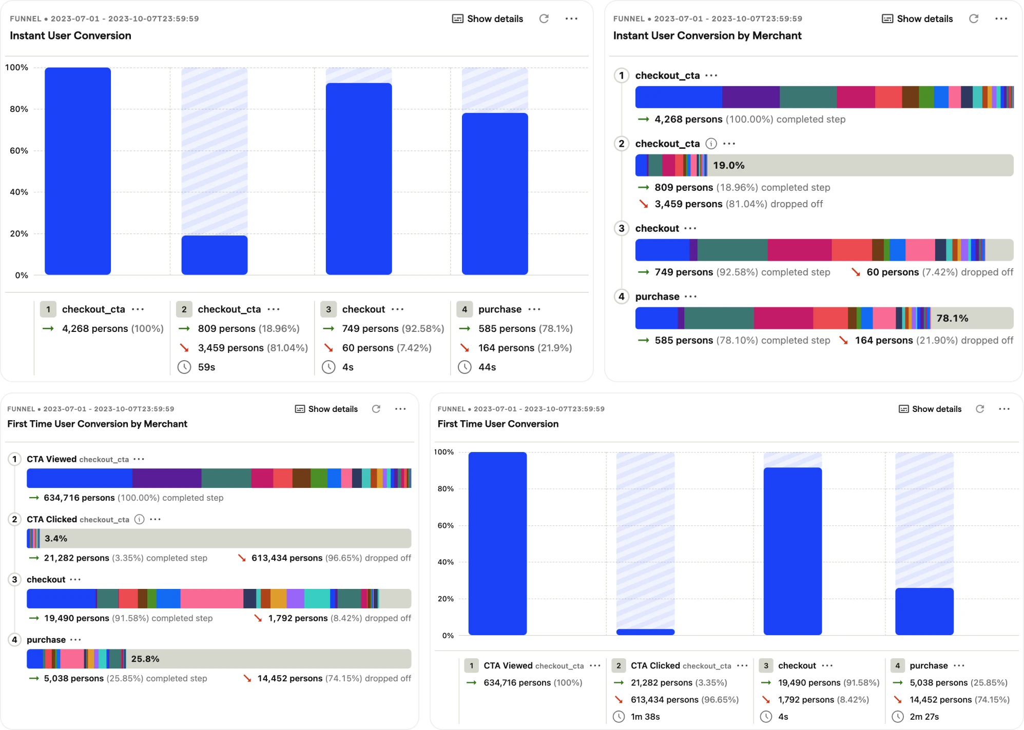
While in the early stages of merchant growth and product development, I collected user insights through Hotjar and regular discussions with the customer success and sales teams. As we were quickly processing thousands of transactions, I spearheaded the integration of an analytics tool to gather real-time quantitative data. This involved sourcing, reviewing, and integrating Posthog. Through this integration, we identified friction points:
Only 1% of product page impressions were captured.
50% of shoppers abandoned the checkout at the delivery address section.
Another 50% dropped off at the payment screen.
Mobile conversions were at 75% of desktop conversions.


We also identified opportunities to reduce friction for repeat customers. In summary, we needed to improve top-of-funnel engagement and address significant drop-offs in the checkout process, particularly on mobile devices.
Objectives
Based on data analysis and qualitative insights, I proposed three objectives for the redesign:
Simplify the checkout process: Streamline the experience to reduce friction and prioritise ease of use, mainly focusing on repeat users.
Enhance user acquisition: Improve top-of-funnel engagement to attract and retain more users.
Expand payment and delivery options: Expand the variety of delivery and payment methods to accommodate diverse shopper preferences.
Throughout the project, I implemented a mobile-optimised design approach to ensure seamless usability across all devices, considering the mobile conversion rate and proportion of users on mobile.
—
Objective 1: Simplify the Checkout Process
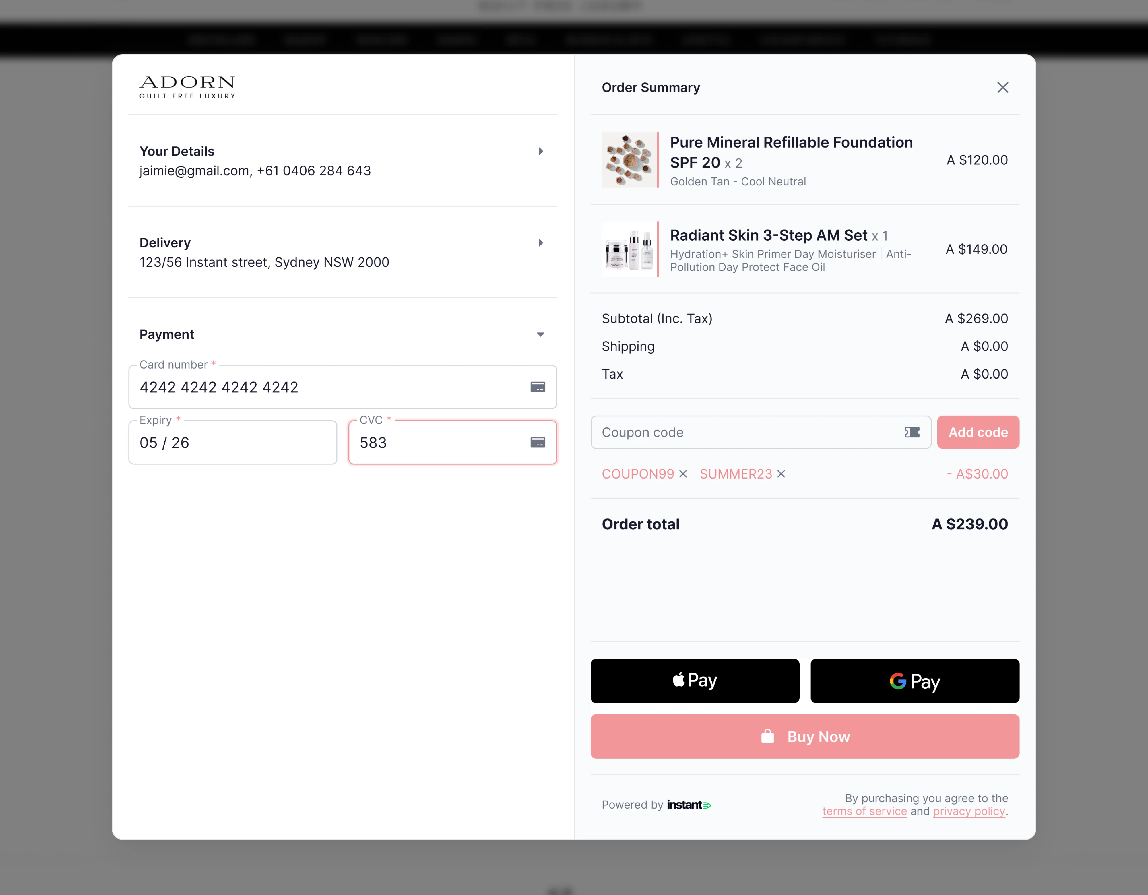
Given the time constraints and limited resources, I needed to move rapidly. I created wireframes and tested them with team members, friends, and family, which allowed for quick iterations and immediate feedback. Our direct customers were merchants rather than end-users, so this method provided valuable insights without extensive delays. Drawing inspiration from external sources, such as the Baymard Institute, I found that complexity is a significant reason for checkout abandonment. To address this, I condensed the entire checkout into a single-page flow, presenting only the necessary actions to the shopper.


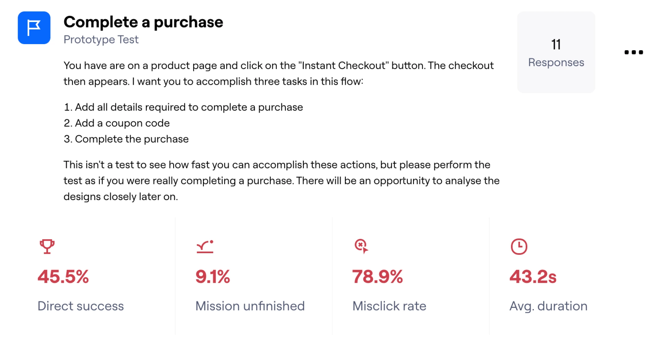
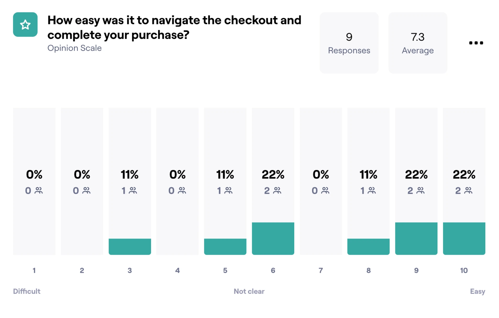
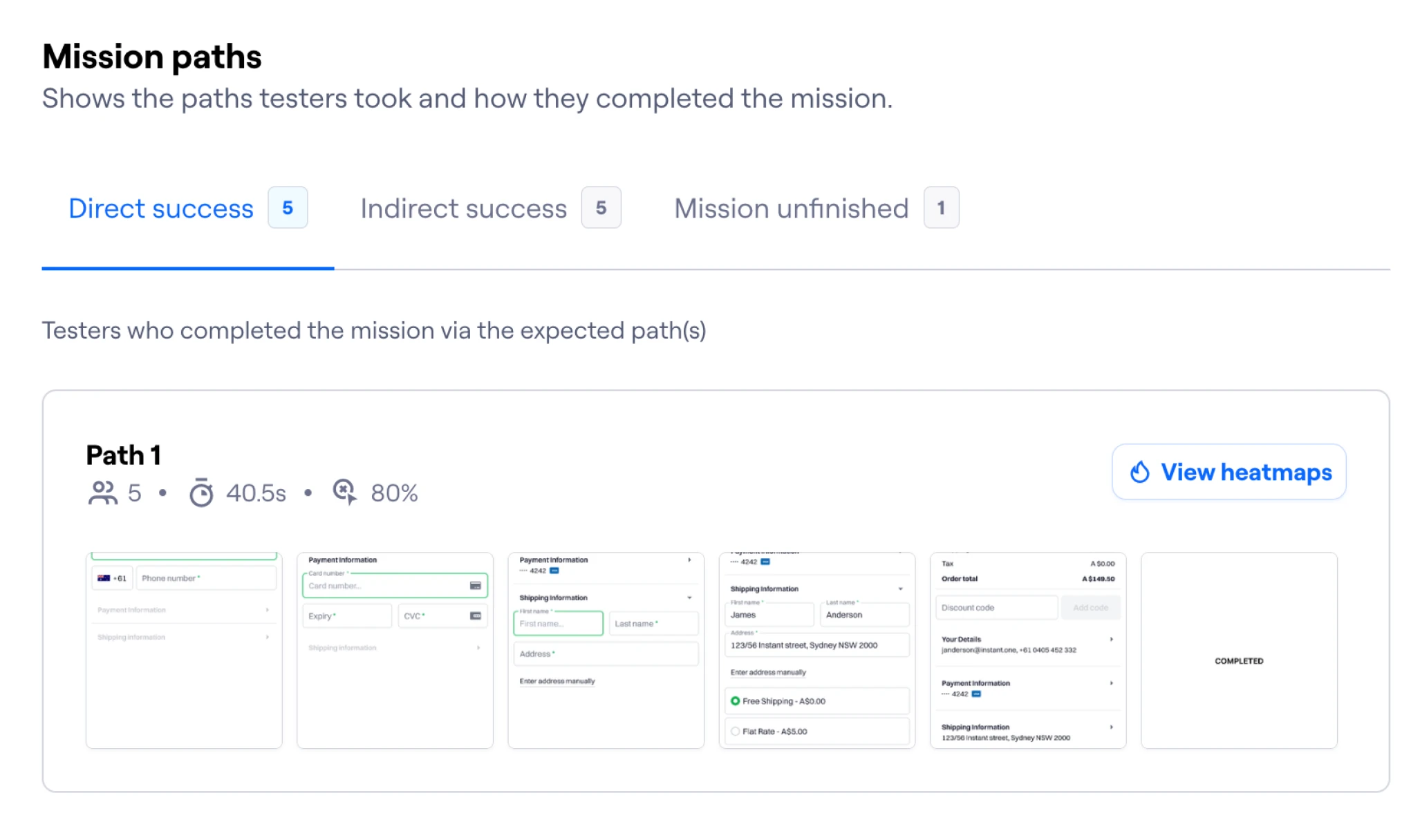
Prototyping and Testing
I created wireframes of the single-page flow and tested them with team members, friends, and family through Maze (a user testing platform) to rapidly iterate and gather feedback. This approach provided valuable insights and minimised delays.

User Testing Insights
I moderated 15 user-testing sessions, drawing insights from a control group:
Collapsible sections kept users focused on the happy path, reducing checkout time by 2x.
In-line CTAs improved navigation on mobile devices compared to sticky footers.
Post-validation of forms was clearer for users than disabling actions like "Continue."
Through continuous design, testing, and feedback cycles, I developed a highly focused one-page checkout flow. This phase also included addressing the needs of repeat customers, which is crucial for our merchants.


Handling Repeat Customers
On average, 25% of shoppers abandon their checkout because they must create an account. This is primarily due to:
The additional step required to complete a purchase.
The friction of recalling and inputting account information.


To solve this problem, we added saving users' information when they completed a checkout and pre-filled it on subsequent visits. This made the repeat purchase experience seamless and consistent. It also allowed us to keep a consistent checkout experience for new and repeat users; we didn't require different flows for both use cases, which would have significantly increased the complexity of the redesign while also solving our repeat customer needs (reducing friction and getting them to completion as fast as possible).

Agile Collaboration with Engineering
Working directly with the engineering team in an agile manner, I built the front-end UI and handed it off to the engineers for integration. This collaboration ensured that the design was implemented accurately and efficiently. We conducted regular sprint reviews and stand-ups to address issues and keep the project on track.
—
Objective 2: Enhance User Acquisition
To maximise user acquisition, I focused on implementing quick-win top-of-funnel strategies. My primary hypothesis was that adding a CTA to existing merchant checkout pages would drive higher activation for high-intent shoppers. This low-cost experiment was feasible and effective due to the number of customers at this time. Recognising the numerous improvements needed across the entire funnel for the checkout experience, these quick wins allowed us to continue moving fast while delivering significant impact.
A/B Testing
I conducted A/B testing across several merchants to validate this hypothesis. The testing involved experimenting with different versions of the CTA copy. The message, "Hey, we can see you have shopped here before; here are your details; if nothing has changed, you can complete your purchase instantly," emerged as the winning copy.

Results
This Approach proved highly effective, increasing average click-through rates by 300%. The successful A/B testing demonstrated the potential of targeted, user-focused CTAs in driving higher engagement and user acquisitions.
—
Objective 3: Giving Shoppers Choice
Various payment options are essential for reducing checkout abandonment and improving the overall user experience. Data indicates that 11% of abandoned checkouts are due to insufficient payment options. To address this, I focused on expanding the range of payment methods available to shoppers.
Incorporating Payment Options
Research shows that Apple Pay can increase checkout conversion by 20%. Considering the drop-off in mobile conversion compared to desktop and overall drop-off on the mobile page, the integration of Apple and Google Pay was the chosen payment method. It aligned with the design paradigm of offering a streamlined, one-step experience. By simplifying the payment process, I aimed to reduce friction and cater to diverse user preferences.

Implementation
Working closely with the engineering team, I built the front-end UI for the new payment options and seamlessly integrated them into the existing system.

—
Summary
The redesign of the Checkout product was highly successful in achieving our objectives and significantly improving key performance metrics. By breaking the redesign into three parts—simplifying the checkout process, enhancing user acquisition, and expanding payment and delivery options—we delivered value iteratively and continuously tested and refined the design. Starting with the one-page checkout flow provided a solid foundation before incorporating top-of-funnel and payment improvements.
Results:
Increased click-through from initial impressions by 4x.
Doubled the conversion rate for the checkout.
Mobile overtook desktop as the highest converting platform.
Stabilised bounce rates across the checkout journey with no bottlenecks.
This iterative, data-driven, and customer-centric approach significantly enhanced the checkout product's user experience and business performance.


